
For Best Results
Please use these tips!
🎯 Why It Matters
We want your students’ art to print beautifully, so they’re excited to wear it, and you’re proud to hand it out.
Here’s how to make sure every drawing is shirt-ready!
🖍️ Use Our Template
Only use the drawing sheet we provide (PDF). It helps us size, align, and prep every portrait correctly.
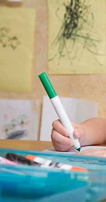
✏️ Pencil First, Sharpie Second
Have students sketch with pencil first, then trace with a fine-tip black Sharpie.
For younger students, it’s okay to trace for them!
✅ Clear lines = crisp shirts
🚫 No pencil only, colors, highlighters, or smudgy markers
✍️ Write Names Clearly
Every drawing needs a name, written neatly underneath or beside the portrait.
Keep it legible and out of the corners. That’s how we make sure every student gets represented!
🧼 Keep it Simple
No scenes, pets, or extra doodles. Just a self-portrait or a name/signature.
It makes the shirt more uniform and more wearable!
🖨️ Scan the Drawings & Forms
Scan each page at in black + white mode (not grayscale).
It is important that they are not pictures of the drawings or forms because of the shadows and backgrounds often included. Send all drawings and forms to: classroomtees@yahoo.com
💡 Teacher Pro Tips
-
One drawing per box
-
Avoid lines or names touching the edges
-
Save files as PDF or high-res JPEG
-
No scanner? There is a scanning option in the notes app if you have an Iphone.
🎉 Last Thing: Don’t Overthink It
These don’t need to be masterpieces. The best shirts come from wobbly lines and silly stick figures.
It’s about joy, not perfection.

Drawings
Have students draw either a portrait or a stick figure using our drawing template.
✅ Start with pencil, then trace with a fine-tip black Sharpie
✅ Erase all pencil marks
✅ Drawings should be simple with no extra items or backgrounds
✅ Names should be clear, not squished next to the drawing
✅ Please keep drawings from touching the divider lines
Keep it bold, clean, and centered with a name that’s easy to read. It makes their art stand out and your shirt design pop.
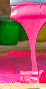
Shirt / Ink colors
The best combos? Light shirts + dark ink.
That’s what makes your students’ artwork pop and keeps things crisp when we print.
Our fave combos:
-
💛 Yellow shirt + Bright Blue ink
-
🩶 Light Gray + Navy Blue
-
🩵 Light Blue + Dark Purple
-
💚 Light Green + Dark Green (monotone magic!)
-
💗 Light Pink + Hot
Pro tip for field trips: The brighter the shirt, the easier it is to spot your kiddos in a crowd. We’ve got tons of color options, and we’re happy to help you choose the perfect combo—just ask!
Common Drawings Mishaps
To get the best print results, simplicity is key.
🖍️ No coloring or shading.
Shaded or filled-in areas print as solid blobs, which means kids won’t see the cool little details they worked so hard on.
🖋️ No Sharpie first.
Younger students should always draw in pencil first, then trace with Sharpie. Going straight in with marker usually = chaos.
Every drawing must be traced in black Sharpie or thick black ink before being scanned and emailed to us. Keep it bold, simple, and unshaded. We promise it’ll look amazing.

Ink Colors We Don’t Recommend
We want your shirts to look amazing—and some colors just don’t cooperate.
🚫 White ink
White requires a special drying process (called flash drying) that we can’t do with our portable setup. While we can print it, it often looks dull or spotty—not the crisp, bright white you’re probably imagining.
🚫 Neon ink on dark shirts
Neon colors don’t show up well on dark fabrics and can end up looking muddy instead of bold.
Instead, we recommend pairing bright inks with light shirts or going for high-contrast combos. Not sure what to pick? We’ll help you choose a combo that looks awesome and prints perfectly.